
News
FiberCop: A new identity for the future
An essential and contemporary design
A new logo, a new website, a new visual identity. FiberCop - the operator of the most extensive and widespread digital infrastructure in Italy - has refreshed its image across all major points of contact with the public. The aim is to convey an essential image, aligned with its role as a technological enabler that turns digital innovation into a driver of development.
The new logo, based on the “Aspekta” font, is paired with a distinctive symbol in which the “F” of “Fibre” and the “C” of “Copper” intersect - representing a strong connection that reflects FiberCop’s firm commitment to the digitalisation of Italy’s economy.
An essential, contemporary design that also contains a powerful reference to the company’s core mission, enabling the country’s growth, visually expressed through the presence of the Italian tricolour in the symbol. The new visual identity is intended to reflect the reliability of the infrastructure serving the country’s entire economic system, and the expertise of the people responsible for building and managing it.
This is more than a graphic refresh. The company’s digital channels are also being renewed: websites with a more streamlined layout and consistent style across institutional and commercial pages; social media platforms with richer content, designed to strengthen engagement with customers and other stakeholders.
With the launch of this new identity, FiberCop moves from a communication style focused on the “what” (technical data and features) to one that emphasises the “why”- the concrete benefits for citizens, businesses, and the country as a whole. In parallel, the company has defined its Purpose, Vision and Values, the everyday pillars for the more than 18,300 people driving Italy’s digital transformation.
Related news
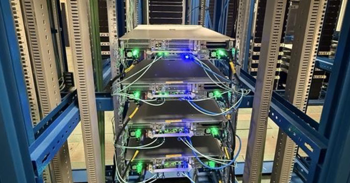
FiberCop: with Microsoft, Dell Technologies, and 6WIND, first Edge Cloud solutions for advanced Telco services
Read more
“What Unites Us”: FiberCop’s New Corporate Video
Read more
FiberCop tests 400-Gigabit-per-second fibre access in Italy for the first time
Read moreAsk for Information
If you would like to receive further information, fill in the form and you will be contacted by our team.